Sample report
acme-analytics.example
62/100 · Solid · Better than 64% of pages analysed
Weighted score 68 · −6 calibration · Final 62
A clear, well-proven SaaS page with real screenshots and testimonials that just needs sharper CTA copy and a tighter hero visual.
- Clarity74
- CTA61
- Trust58
- Mobile72
- Speed81
The 5-second test
What a first-time visitor gets
This is an AI-powered tool that handles customer support chats and somehow ties into product feedback and analytics, with a badge suggesting it did well on Product Hunt.
What they should get
This is one platform that replaces Fieldnote, Pollwise and Chatterly by turning support conversations directly into prioritised product insight, for one flat price.
Your page, annotated
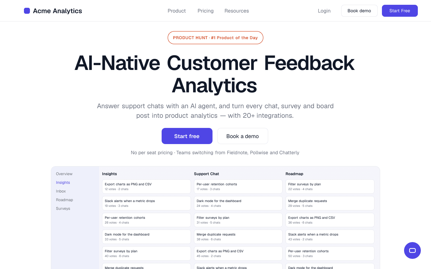
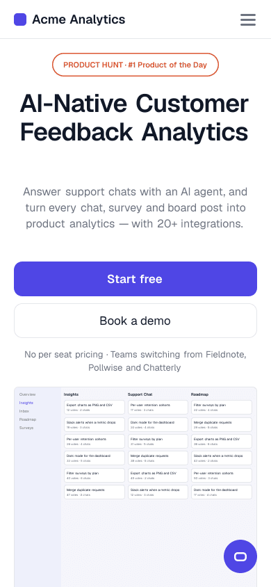
The first screen on desktop and mobile. Each number is a finding below — click it to jump there.
Do these 5 things this week
- 01'Start free' button text is genericChange the button to 'Start free — no card needed' to pull the footer's reassurance up into the hero.
- 02Product Hunt badge has no link or dateLink the badge to the actual Product Hunt launch page and add the launch date.
- 03Hero product screenshot is illegible on mobileSwap the full dashboard for a cropped mobile close-up of one clear UI element, like the insights list.
- 04Heavy stacked UI screenshots down the pageCompress and lazy-load the screenshots below the first screen so only the hero image loads right away.
- 05'AI-Native' in H1 is jargon before the subhead landsLead with the outcome, e.g. 'Turn every support chat into product insight', and keep 'AI-native' in the subhead.
All findings
11 findings, grouped by category. Start with high impact, quick fixes.
Clarity
74/100Why this score: The headline 'AI-Native Customer Feedback Analytics' plus the subheadline naming chats, surveys, boards and 20+ integrations, backed by a real product screenshot, makes the offer clear within 5 seconds, though 'AI-Native' still needs the subhead to land.
- 5Low impactQuick fix
'AI-Native' in H1 is jargon before the subhead lands
- Evidence
- H1: 'AI-Native Customer Feedback Analytics', followed by 'Answer support chats with an AI agent, and turn every chat, survey and board post into product analytics.'
- What's wrong
- The H1 'AI-Native Customer Feedback Analytics' leads with an abstract qualifier that only becomes concrete once the visitor reads the subheadline about chats, surveys and boards.
- Why it costs you
- A visitor who only skims the headline doesn't immediately get what the product does, which adds a beat of confusion.
- Fix
- Rewrite the H1 to 'Turn every support chat into product insight' and keep the current subheadline (or a trimmed version) to carry the 'AI-native' detail.
- 6Low impactQuick fix
Nav item 'Resources' gives no clue what's behind it
- Evidence
- Top nav: 'Product | Pricing | Resources | Login | Book demo | Start Free'; the footer shows that 'Resources' covers Blog, Docs and Help Center.
- What's wrong
- The top navigation lists 'Product', 'Pricing' and 'Resources', but a first-time visitor can't tell whether 'Resources' leads to docs, a blog or comparisons.
- Why it costs you
- Vague nav labels slow down visitors who want to check details before they sign up.
- Fix
- Rename the item to 'Docs & Guides', or turn it into a dropdown that shows 'Blog', 'Help Center' and 'Docs' by name.
Call to action
61/100Why this score: One primary 'Start free' button is consistently styled and paired with a secondary 'Book a demo', with a friction reducer ('No per seat pricing') right below, but the button text is generic and repeats without variation.
- 1Medium impactQuick fix
'Start free' button text is generic
- Evidence
- Hero button reads 'Start free'; 'No per seat pricing · Teams switching from Fieldnote, Pollwise and Chatterly' sits below it, and 'No credit card' only appears in the footer.
- What's wrong
- Both the desktop and mobile hero use the plain label 'Start free' with no friction reducer on or next to the button, even though the page later says 'No credit card' in the footer.
- Why it costs you
- Without a risk-reducer at the button, visitors are left wondering about signup friction right before they click.
- Fix
- Change the hero button to 'Start free — no card needed' and move the footer's 'No credit card' line up next to the button, so the reassurance is visible at the moment of decision.
- 7Low impactQuick fix
No repeated CTA after the long feature sections
- Evidence
- Between the hero CTAs and 'Explore integrations' near the bottom, three feature sections run without a single button.
- What's wrong
- After 'Capture feedback wherever customers share it', 'From scattered feedback to clear product insight' and 'Support customers. Learn from every conversation', there's no button until much further down.
- Why it costs you
- A visitor convinced halfway down has to scroll back up to find the next step, right at the moment of highest interest.
- Fix
- Add a 'Start free — no card needed' button (or a text link) at the end of the 'Prioritise what matters' section, roughly in the middle of the page.
Trust
58/100Why this score: Named testimonials with roles and companies (Priya Raman, Tom Weller, Lena Fischer with a real $34/mo quote) and a Product Hunt #1 badge give solid proof, though no customer logos or photos appear near the hero.
- 2Medium impactQuick fix
Product Hunt badge has no link or date
- Evidence
- The badge shows 'PRODUCT HUNT #1 Product of the Day' as a plain image with no link and no date next to it.
- What's wrong
- The '#1 Product of the Day' badge sits prominently under the nav but isn't clickable and has no date, so a sceptical visitor can't check it.
- Why it costs you
- A badge nobody can verify reads as vague or even made up, which costs trust instead of building it.
- Fix
- Wrap the badge in a link to the live Product Hunt launch and add the launch month underneath in small text, e.g. 'Product Hunt, March 2026'.
- 8Low impactQuick fix
Pricing mentioned inconsistently across the page
- Evidence
- Hero: 'No per seat pricing'; FAQ: 'Starter from $39 a month and Growth from $79 a month'; testimonial from Lena Fischer: '$34/mo flat is solid too.'
- What's wrong
- The hero says 'No per seat pricing', the FAQ says 'Starter from $39 a month and Growth from $79 a month', and a testimonial quotes '$34/mo flat': three price signals with no single source of truth above the fold.
- Why it costs you
- Conflicting prices make a sceptical buyer distrust all of them, or wonder which one is current.
- Fix
- Replace the vague hero line with the current price, 'Flat pricing from $39/mo — never per seat', and update or remove the testimonial's old $34 figure.
- 10Low impactMedium effort
No customer logos near the hero
- Evidence
- Hero line 'Teams switching from Fieldnote, Pollwise and Chatterly', with no logo images anywhere near it.
- What's wrong
- The hero says 'Teams switching from Fieldnote, Pollwise and Chatterly' but shows no company logos anywhere in the first screen.
- Why it costs you
- Names without logos are harder to scan and check at a glance, so the hero misses its quickest credibility boost.
- Fix
- Get permission for 4–5 logos of customers already named in the testimonials (Northwind Labs, Pinecrest, Tallyho, Brightpath, Loopwise) and place them in one row directly beneath the CTA buttons.
Mobile
72/100Why this score: Headline, subheadline and both CTAs are visible without scrolling on mobile and the layout doesn't break, but the product screenshot below is cramped and text-heavy for a small screen.
- 3Medium impactMedium effort
Hero product screenshot is illegible on mobile
- Evidence
- On mobile, the image under the hero shows the full multi-column board ('Insights / Support Chat / Roadmap…') with row text far too small to read.
- What's wrong
- On mobile, the dashboard screenshot below the CTAs is shrunk down so far that its row text ('Export charts as PNG…') can't be read without pinch-zooming.
- Why it costs you
- A visitor scrolling past an unreadable product shot loses the strongest proof that the tool is real and polished.
- Fix
- Create a separate, cropped mobile image that shows one insight card or list row large enough to read at native size, and serve it on small screens with a responsive srcset or <picture>.
Speed
81/100Why this score: Your Speed score is Google's mobile performance score for this page (81/100).
- 4Medium impactMedium effort
Heavy stacked UI screenshots down the page
- Evidence
- Detailed screenshots of the insights board, feedback capture, support inbox and prioritisation view, each a large full-width image with dense on-screen text.
- What's wrong
- The page stacks at least five large, detailed product screenshots (insights board, feedback portal, inbox, prioritisation view) plus a chat widget fixed in the corner. Measured on mobile, the main content takes 3.1 s to appear (good is under 2.5 s), even though Google's overall performance score is a decent 81/100.
- Why it costs you
- Large, detail-rich images compete with the hero for bandwidth on mobile connections, so the first screen shows up later than it needs to.
- Fix
- Compress all screenshots to WebP, cap their width at ~1200 px, and add loading="lazy" to every image below the first screen. Keep only the hero screenshot eager and give it fetchpriority="high".
Copy
- 9Low impactQuick fix
One customer's setup time reused as a page-wide claim
- Evidence
- Testimonial: 'Acme turned our feedback chaos into a clear roadmap. Setup took 10 minutes.' (Priya Raman). FAQ: 'Most teams are live in about 10 minutes.'
- What's wrong
- 'Setup took 10 minutes' from Priya Raman's testimonial is echoed almost word for word later as a fact: 'Most teams are live in about 10 minutes.'
- Why it costs you
- Turning one customer's anecdote into a general claim can look like the number was invented, not measured.
- Fix
- Change the FAQ line to 'Many teams are live within an hour; some, like Northwind Labs, set up the core flows in 10 minutes.'
Design
- 11Low impactMedium effort
Testimonial wall is a long, uniform list
- Evidence
- Eleven testimonials (Tom Weller, Marta Kowalski, Sam Okafor, Diego Alvarez, Lena Fischer, Aiko Tanaka and more) in identical formatting, none with a photo.
- What's wrong
- The testimonials section stacks more than ten quotes (Tom Weller, Marta Kowalski, Sam Okafor, Diego Alvarez and more) in one dense block without photos or hierarchy.
- Why it costs you
- A wall of identical-looking quotes is hard to scan, and the strongest proof gets lost in it.
- Fix
- Pick the 3 most concrete quotes (Lena Fischer's pricing comparison, Diego Alvarez's switching story, Priya Raman's setup time), add headshots, and put the rest behind a 'Read more customer stories' toggle.
Hero rewrite
Three angles for your headline and subheadline. Pick one, test it, keep what wins.
Outcome
Turn every support chat into a prioritised product roadmap
Answer conversations with an AI agent while every request, vote and survey response rolls into one evidence-based roadmap. No copy-pasting.
Pain
Stop copying feedback between six different tools
Support, surveys, feedback boards and analytics live on one customer record, so nothing gets lost between your helpdesk and your product plan.
Specificity
One AI agent, 20+ integrations, one flat price from $39/mo
Answer support chats, merge duplicate feedback, score requests by revenue impact and tell customers when features ship, without per-seat pricing.
CTA button texts
- Start free — no card needed
- Book a 15-minute demo
- See it on your data
Speed
- Performance score
- 81
- Google's overall mobile speed score. 90+ is good.
- Largest Contentful Paint
- 3.1 s
- When the main content appears. Under 2.5 s is good.
- Cumulative Layout Shift
- 0.02
- How much the layout jumps while loading. Under 0.1 is good.
- Total Blocking Time
- 190 ms
- How long the page is too busy to react to taps. Under 200 ms is good.
Google's mobile test scores this page 81 out of 100: 'needs improvement', but close to good (90+). The one number worth fixing is the Largest Contentful Paint of 3.1 seconds. That's how long the main hero content takes to appear on a phone; under 2.5 seconds is good, and every second beyond that loses impatient visitors. The layout shift is just 0.02, so buttons and text stay put while the page loads, and a Total Blocking Time of 190 ms means taps respond quickly. In plain terms: the page is stable and responsive, it just shows up a little late on mobile, most likely because the large product screenshots further down load at the same time as the hero instead of when they're scrolled into view.